Annie Sloan Romania chalkpaint.ro

the context
the client
The team behind chalkpaint.ro are enthusiasts of decorative furniture painting, focused on promoting Annie Sloan’s product line in Romania and Hungary. They support customers through tutorials, workshops, technique guidance, and creative inspiration, catering to DIY enthusiasts and professionals interested in decorative painting and furniture restoration.
The site chalkpaint.ro serves as the the representative of Romanian distributors for Annie Sloan Chalk Paint, offering both the paint products and instructional resources.
the problem
The previous website struggled to engage visitors and lacked a clear focus on the unique possibilities of furniture painting.
• navigation: All the articles were listed in the blog without giving a structure to it, it was hard to navigate between them and find the right content. The user was missing on interesting articles, workshops.
• experience: It can be discouranging to see a lot of succesfull home-decor projects and not knowing where to start yours, what kind of tools do you need or where you can buy the necessary tools.
• SEO: poor SEO hurts the ranking and provides a bad user experience.
my role
UX/UI designer, responsible for designing the architecture and styleguide of the website
• digital wireframing
• low-fidelity protoyping
• responsive styleguide
• SEO and accessibility guidelines
the approach
the goal
The new website was designed to ignite a passion for furniture painting by showcasing it as a powerful tool for home decoration. It is not the website of the Romanian Annie Sloan brand but rather the website of a community that promotes the message of creating a unique home by hand-painted or refurbished furniture, wall decoration, and resells Annie Sloan pains and products.
By introducing the Annie Sloan brand and offering inspirational content, the aim was to familiarise and endear visitors to this creative art form. The site will guide them through the process of discovering, experimenting, and eventually diving into furniture painting, leading them directly to trusted dealers for their purchases.
To achieve this, the goal was to restructure the content of the website:
• to have a strong landing page that shows the wide variety of content;
• to clarify and categorise the blogpost so the user can easily find information about techniques, products or inspirational projects;
• to communicate more clearly about the organisation behind the project;
• to make it easy for the user to find the closest reseller if they would like to buy the products;
the landing page
The structure of the landing page was the biggest challenge. Its purpose is to convey the values of the main brand, to inspire, to take the user to tutorials and then to the stockists’ sites, where they can buy the products. There should be lots of pictures, videos, mostly showing furniture painting either as an activity or as part of interior design.
the blog
To offer a seamless navigation the blog is structured by three main categories:
• articles about techniques: how should I start? Step by step tutorials, descriptions, videos about techniques.
• inspirational articles: showcasing projects from around the world, and DIY projects sent by the users.
• products: what should I work with? Product presentations, tipps and advantages of different products.
Question: should have three separate presentational pages for the three main paint types: Chalk paint, Satin paint and Wall paint?
Solution: Since the goal of the website was to inspire and promote home decor and not just the Annie Sloan products I decided to keep it simple and highlight only three articles about the three types of painton the Products page.
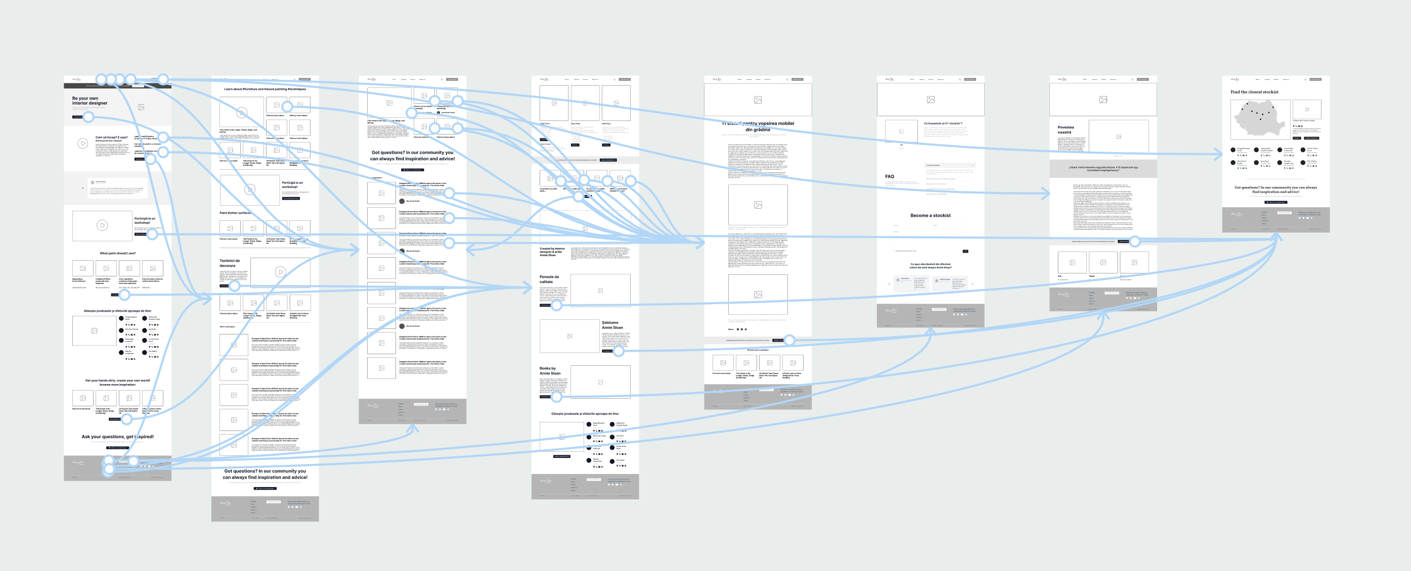
the sitemap

low-fidelity prototype in Figma

the styleguide
layout
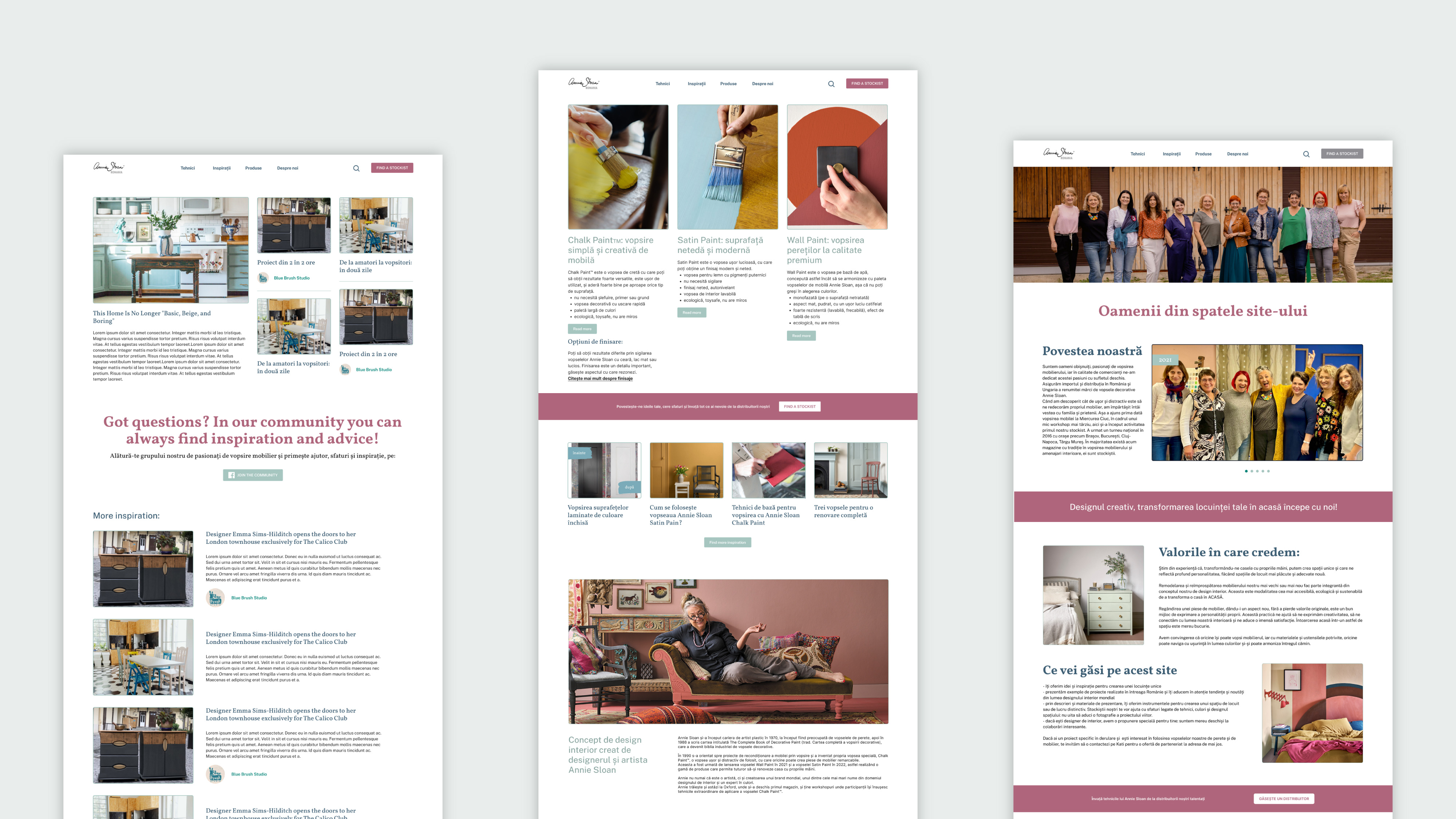
The goal was to create an interior design magazine-like site. To achieve this I used a multi-column grid for structure and a strong typographic hierarchy to guide the reader’s attention. High-quality images, ample white space, and card-style blocks for articles add visual appeal and readability. Accent colors and subtle animations enhance the experience, while clean, minimalist navigation keeps the focus on content. Together, these elements create a polished, editorial look that engages users. Infinite scroll on articles page helps the user to get lost in the inspiration.
typography
Vollkorn
For headlines I used a modern, sophisticated serif font to add elegancy and refinement.
Public Sans
For content and articles, I opted for a clean sans-serif font to ensure legibility and a contemporary feel.
color
The color palette was inspired from Annie Sloan’s paint colors to create a tranquil yet vibrant feeling.
The green-turquoise serves as a refreshing base, evoking a natural, serene feel, while the deep, sophisticated dark blue adds depth and
grounding. Accents of dark rose introduce warmth and subtle elegance, balancing the bolder colors with a delicate touch.

styleguide for screen variations

examples
For SEO optimization, I established a clear heading hierarchy, added descriptive alt text for images, and labeled buttons and links clearly.

