Stories of Data
the context
the client
Stories of Data specializes in transforming raw data into meaningful insights and interactive visualizations for businesses, focusing primarily on Power BI and custom data applications. They offer tailored data services, including analytics, interactive data visualizations, and fully integrated applications that embed analytics directly into clients’ SaaS products, aiming to make data insights accessible and actionable across all levels of an organization. Their services include Power BI tenant management, report building and custom visualizations.
visit websitethe goal
After the team finalized the brand, the goal was to showcase the company’s expertise in data visualization, analytics, and Power BI services.
The client requested a distinct design for thePortfolio section that would feel separate from the main landing page, enabling users to browse through case studies with ease and explore those of interest in greater detail. Each case study includes three levels of detail:
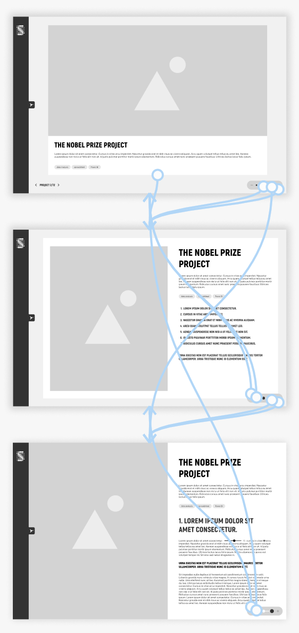
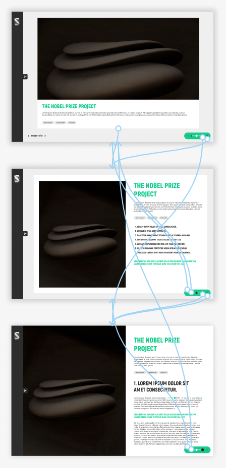
• Summary view: an overall view about theproject, typically displayed in a full-screen, interactive Power BI embed window.
• Key subjects view: A mid-level overview that expands on the project details, providing more specific information about the case study.
• Detailed view: The most comprehensive level, featuring in-depth descriptions, charts, and data visualizations.
my role
As UX designer and web developer I was responsible for designing the logic of the navigation within the Portfolio and implementing it.
• digital wireframing
• high-fidelity prototyping
• webdevelopment
the approach
target audience
The ideal customer is a medium-sized business or a startup. They have lots of data needs and they want to either ship products heavily reliant on data and analytics or need to do lots of internal analytics that benefit their main business or non-profit goals.
the structure
For case studies with the same structure I always recommend using the Webflow CMS collections because the template page offers consistency across case studies.
In this case however the client decided to use static pages instead of dynamic ones.
Main navigation
The main navigation of the Portfolio is an expandable menu with the case studies. With this solution the user can easily access the landing page and browse between the projects.
View navigation
The portfolio section showcases case studies across three levels of detail. Since this structure is an unconventional approach to presenting information, the challenge was to design a visual solution that clearly communicates the navigation flow and manages user expectations.
From a SEO and marketing perspective, we decided to integrate the three views into a single page. This approach ensures that all views share the same URL, allowing customized transitions between them.

View implementation
Webflow as a no-code design and development tool known for its flexibility and control over design elements. Webflow’s Designer was used to build the layout and styling while ensuring responsive design across devices.
navigation between the views
Technically, the three layers of content are stacked on top of one another, with each layer occupying the full viewport. Initially, only the summary view is visible. As the user zooms in, the more detailed view appears while the summary view is hidden. The user can then navigate through the visible layer using scrolling. Similarly, when zooming out, the detailed view is concealed and a less detailed view is shown.
Since we decided to integrate the three views into a single page I had the possibility to play around with the animations. The user zooms in and out between the views, the goal was to recreate this effect on click.The Zoom in animation from Summary view to Key subject view scales up the window as you would dive into the details. The animation from Key subject view to Detailed view zooms in and grows the project window to full screen. The animations make it easier to understand the structure of the information and the navigation between them.
The navigation between the projects and between the views are also accessible by keyboard. We set up a keyboard combination for each action:
Previous case study: Ctrl + A
Next case study: Ctrl + D
Zoom in: Ctrl + S
Zoom out: Ctrl + W
When the user enters the portfolio, small tooltips are shown to help users navigate around the site. More tooltips show the action of each button on hover interaction.

A data story -
Redesigning LinkedIn Analytics
The data story Redesigning Linkedin Analytics is not included among the previously presented case studies becuase of its unique theme, but it serves as an engaging example of storytelling through data visualization.
The client, an expert in data visualization, proposed an alternative approach to enhance LinkedIn Analytics.
I collaborated on this project with a senior designer, who created the animation, while I developed the page, set up the scroll animation, and fine-tuned the timing.
For the best experience, viewing on a desktop is recommended.
